

Color plays an important role in our lives. The colors around us can impact our thoughts, moods, and emotions.
Scientists would say that colors don't exist outside of the mind. Even though this is true in physics, there's no doubt in psychology that colors influence us in interesting ways.
Interior design is all about creating surroundings that make us feel comfortable and happy. As you can imagine, colors are a vital part of interior design solutions. Picking the wrong colors can backfire with the creation of too much intensity. Instead, choose the right shades and hues to have positive psychological benefits and higher reselling value, advises Haas Properties.
In this article, we'll cover the main psychological effects of colors in interior design.
Blue

PHOTO: HOUSE BEAUTIFUL
Blue is the favorite color of many people. It's considered to be one of the most, if not the most, popular color in the States. This color has a calming effect. When we look at cultural connotations, blue is linked to loyalty, trust, truth, faith, and heaven. As you can see, blue comes with mainly positive associations. Using pastel blue tones in your home allows for tranquility and relaxation. However, avoid using lighter tones of blue in rooms that receive little sunlight.
Purple

PHOTO: KEMBLE INTERIORS
Purple is associated with luxury and royalty. In smaller amounts, you can successfully use purple to give depth. Lighter tones of purple may induce sensations of calm. Shades of lavender are a fantastic choice for bedrooms and lounges.
Yellow

PHOTO: GAL MEETS GLAM
Do you want to add happiness and joy to your home? Yellow is the color of energy and sunshine. You can paint the walls in yellow in your kitchen and dining rooms. Refrain from using dark or dull yellow in your interior design. It's not a positive color as it's associated with jealousy and sickness.
Bright tones of yellow, on the other hand, make for a great choice. Picking yellow tones in your home design provide an uplifting sensation all year round. It's the ultimate interior design recipe for keeping an optimistic outlook on life.
Orange

PHOTO: THE DUNMORE
Orange is all about fun and playfulness. According to experts, orange is a color that stimulates the appetite. That's why it's not a bad idea to incorporate some orange tones in your kitchen.
Orange works well in schools, hostels, and large organizations. This color supports social behavior and creating new connections between people. As it's a cheerful and happy color, it will do a good job in children's rooms. Blue, turquoise, and yellow can make a great match with orange. Try it out yourself!
Green

PHOTO: TRADITIONAL HOME
Green is the color of nature, growth, and freshness. It is believed to harbor the energy of the natural cycles. By using green, you can create a soothing atmosphere in your home. When you use it sparingly, green can work in almost any room. This color is said to have similar effects with blue.
Pink

PHOTO: THE PINEAPPLE PAD
Pink is a feminine color in many cultures around the world. The psychological effects of pink are soothing and refreshing. Spending time in a pink room can boost your energy levels and help you recharge after a long day.
Red

PHOTO: GAL MEETS GLAM
Do you want your interior design to stimulate and energize? Then red is your best bet. Most interior designers recommend using this color sparingly. Too much red can overstimulate and create negative feelings in the long run.
The color of passion increases your appetite. That's why it's commonly used in kitchen color schemes. Some people use it in bedrooms as well for an aphrodisiacal effect.
Black
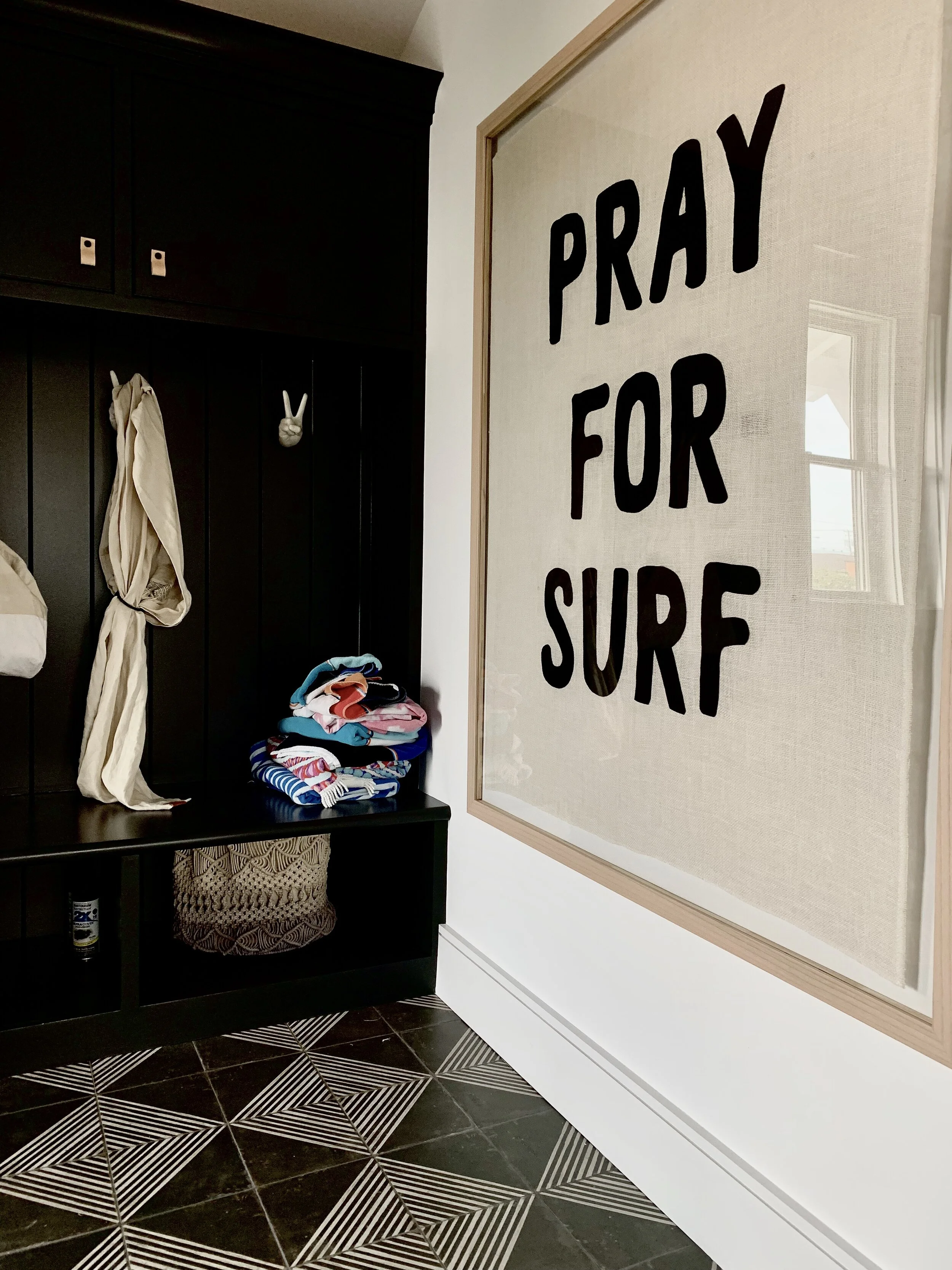
PHOTO: BROOKES DESIGNS
All-black rooms are never a good idea. It gets too dark and grim. But when used smartly, black provides elegance and sophistication like no other color out there. The best strategy is to use black as a highlight color. You can use it for curtains, small tables, picture frames, and other objects that accentuate your room. Black works well in offices. This color communicates formality and seriousness. If that's the look in your office that you're going for, then it's a perfect match.
The bottom line: psychological effects of color in interior design
Colors play a role in forming our mood and emotions. You are able to create a variety of atmospheres when experimenting with different colors in your interior design project.
Avoid using only one color. Most colors and shades work well with others. When you juxtapose different colors, you'll create a more meaningful design scheme, and it’s fun!